out with the old, in with the new
REBRAND CAMPAIGN
Blueshift, 2023-2024
Blueshift.com is a customer engagement and marketing automation platform that uses AI-powered tools to help businesses engage customers across channels like email, mobile, web, and social media.
As the Blueshift’s Design Manger, I spearheaded and executed the rebrand campaign, and I art-directed a third-party web development team to achieve a UX/UI experience on the website that was seamless and pleasant to use.
Assets: rebuild of design system in Figma, brand guidebook, visual updates across website, external pitch decks, a 200+ page internal master deck, revised ebooks and one-pagers, revised video assets, and upgraded paid ads that resulted in a steady increase in lead generation, with a 50%+ MQL conversion rate in our best-performing month.
Skills: brand and identity, digital design, print design, multiple page layout, color theory, cross-functional collaboration, brand implementation, vendor management, art direction, video production
Tools + software: Figma, Adobe Illustrator, Photoshop, After Effects, and Premier Pro
The Glow-Up
When I came aboard, the overall feedback about this branding was that it was outdated, vague in visual hierarchy, and overwhelmed by a sea of dark, stale, corporate blue. As conversations surrounding AI were ramping up, it was important to the company to present itself as approachable, warm, and easy to use for marketers on their own — without an IT team.
BEFORE


CURRENT
The new design features an extended color palette, full-color images, natural photos of diverse users, playful graphic elements, clearer CTAs, and a friendly yet professional tone. I also introduced a purple gradient to soften the harsh blue and to signify a “shift.”
As I led the brand refresh, I implemented it across the website, social media, blogs, emails, collateral, and ultimately, the platform app. Being the team’s sole designer, I executed the entire rebrand over two years in small steps. The launch followed a phased approach: gradually rolling out updates to social, email, website graphics, and collateral before applying the new design site-wide and in the app, ensuring a smooth transition.


brand guide
BUILT FOR SCALABILITY AND CONSISTENCY
To complement the updated branding, I created a comprehensive brand guideline book for internal use and to send to our partners. This also paired with a design system I developed in Figma for efficiency and scalability.
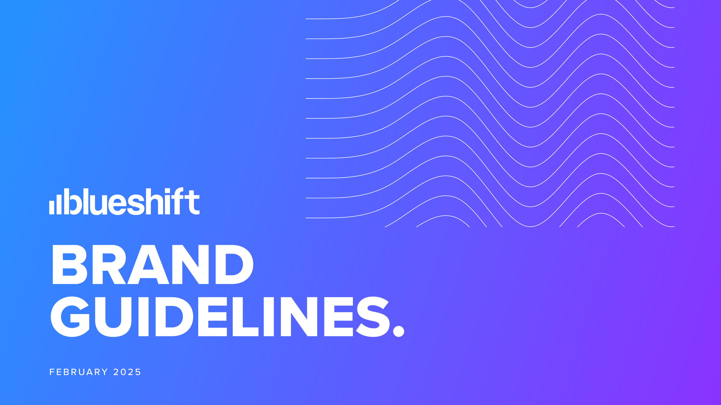
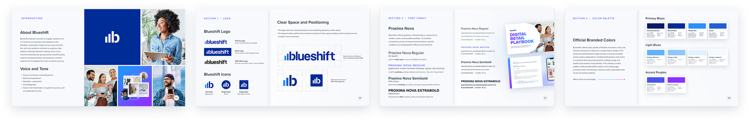
Download a compressed copy of the brand guide here.
platform
TEAMING UP WITH PRODUCT FOR A SEAMLESS USER EXPERIENCE
I worked closely alongside our product team to apply our refreshed color palette to the Blueshift platform.
After some A/B testing, the purple gradient was decidedly too harsh in the app, so we toned it down with our newly branded blues and added purple accents as a compromise.

I also created a few simple animations for our platform’s waiting components.


Animation
BRINGING THE BRAND TO LIFE IN MOTION
I created this simple animation for Blueshift, which serves as the company’s intro and outro for all demo videos and on-demand webinars. The goal was to bring the logo to life in a quick, simple way, in 5 seconds or less, that didn’t distract from the message or appear unnecessarily flashy.
This animation was created in Adobe After Effects.
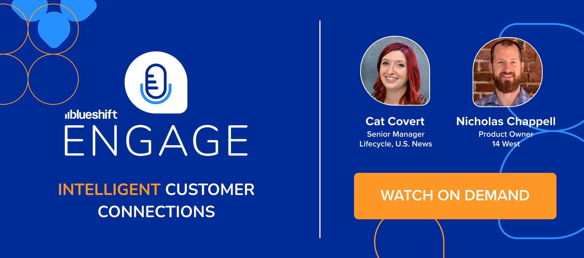
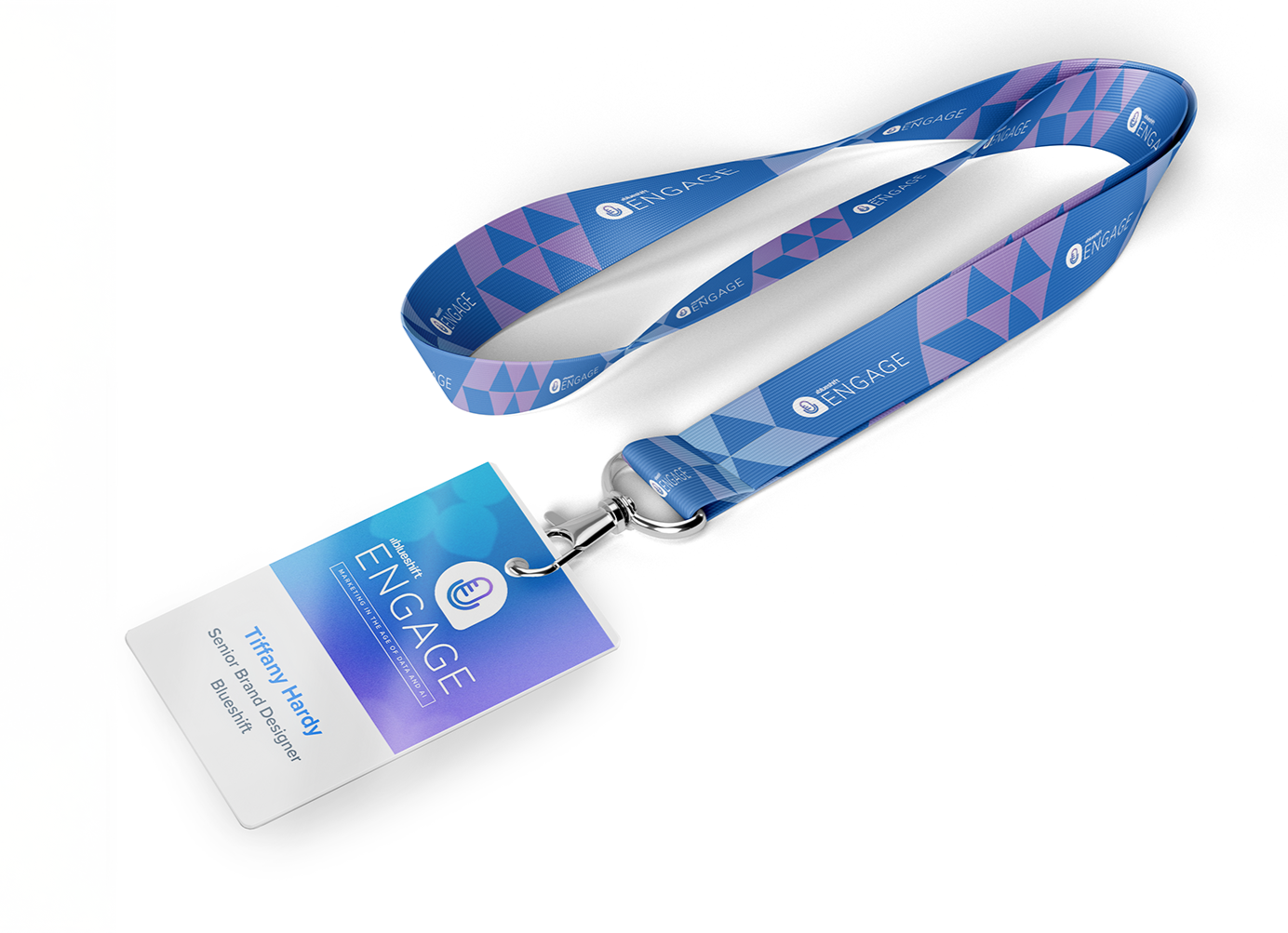
EVENTS
BLUESHIFT ENGAGE 2024
Blueshift Engage is a networking event for customers and prospects to interact with leaders in the industry, be in-the-know for new releases and updates, and connect with Blueshift team members. Engage is a one-day event featuring keynotes, expert panels, and product demos.
In 2024, I rebranded Blueshift Engage to breathe new life into the event and modernize the look. I utilized the same teardrop shapes and logo as before, but put a modern spin on it with our updated color palette.
Below are examples from before and after the upgrade.